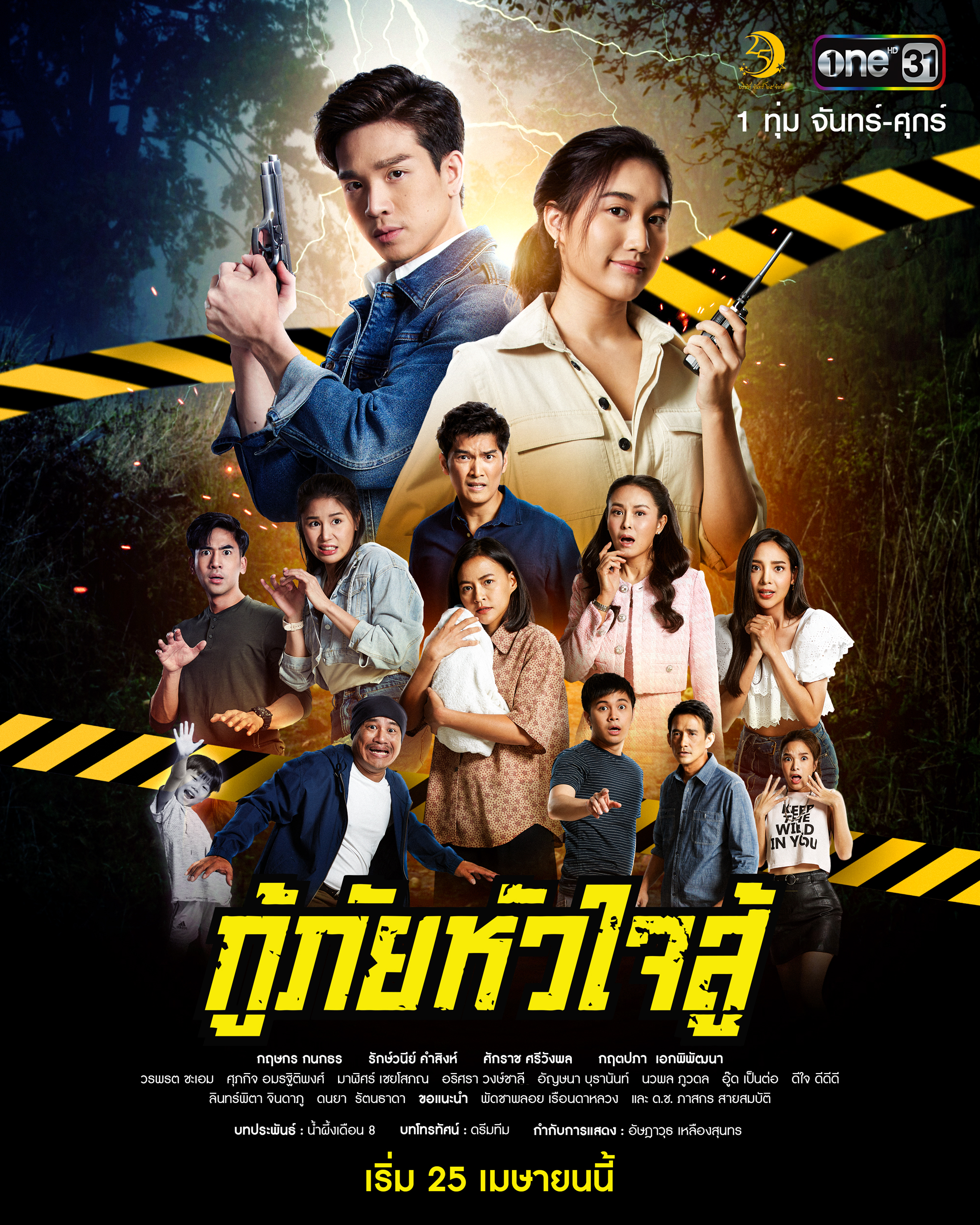
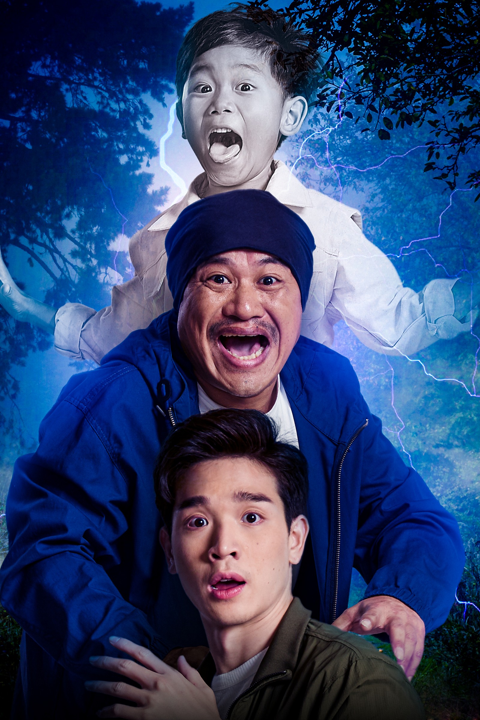
I started working on this project as a key visual designer over a year ago. Excited about the script and everything because it’s such a silly show, but with some horror and supernatural elements that I personally adored in it. Scooby-Doo was thrown in the conversation early on between the director and myself as one of the references for the artwork. And I took it very seriously.
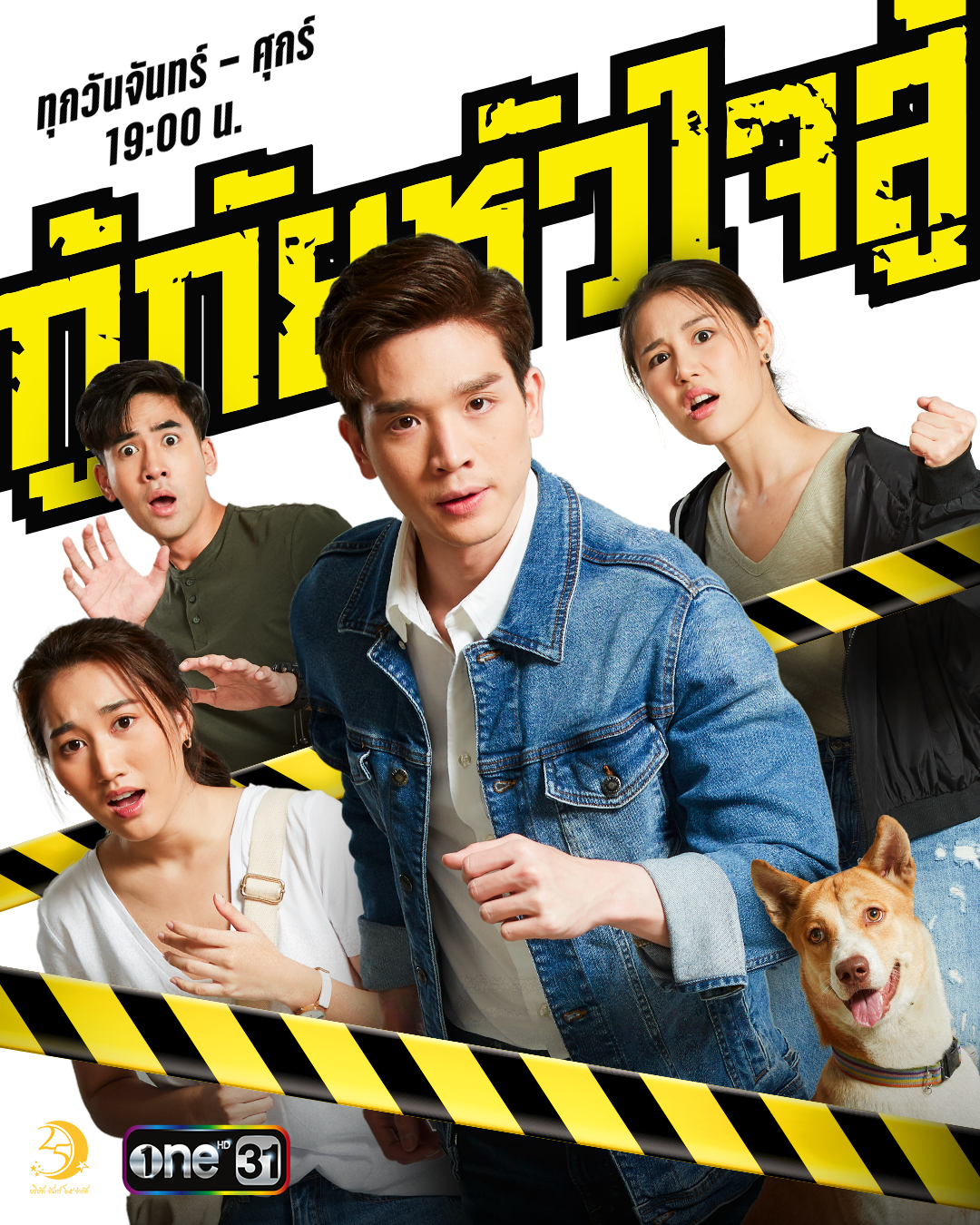
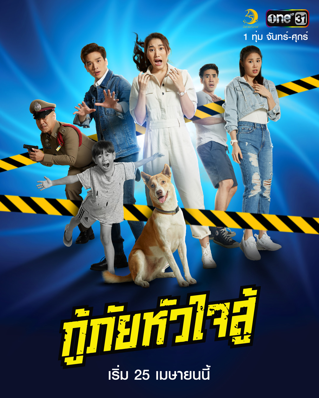
The main visual elements are the yellow caution tape and the lightning. The yellow caution tape was put onto the first set of our character posters. It represents many of the crime/investigation scenes in the show. The lightning in the poster is the most important part to our female lead character. It represents the stormy night that her mother lost her in the taxi when she was just a baby.