

Showing you what I created for the ISTAN’s brand identity. This is not the full branding guideline of the brand, just only a few things my client requested me to do.
Designing a logo and branding for a construction company is not only an exciting process but also a fun challenge for a designer. I had the pleasure of working on a project for The Istan Construction, a construction site company, and I’m excited to share my experience with you!
The Istan Construction is a company that prides itself on delivering high-quality construction and development projects to its clients. The company’s vision and goals were clear from the start, and they wanted a logo and branding that represented their expertise, professionalism, and reliability. The company’s target audience included developers, architects, and builders who needed a trustworthy construction company that would deliver top-notch work.
The first step in the design process was research. As a designer, I needed to understand the construction industry and the audience the company was targeting. I went through various logos and branding materials of other construction companies, studied color psychology and typography that would resonate with the audience, and best represent the company’s values.
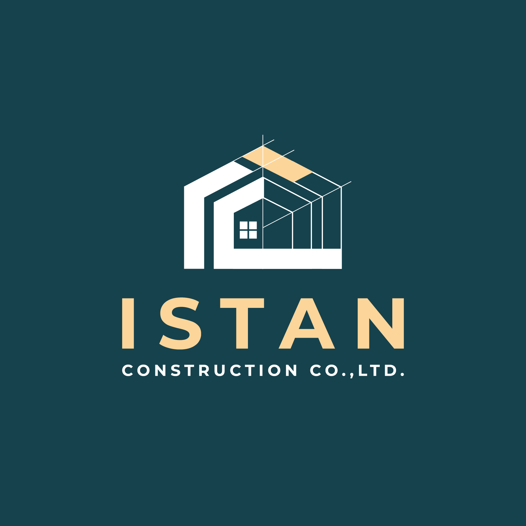
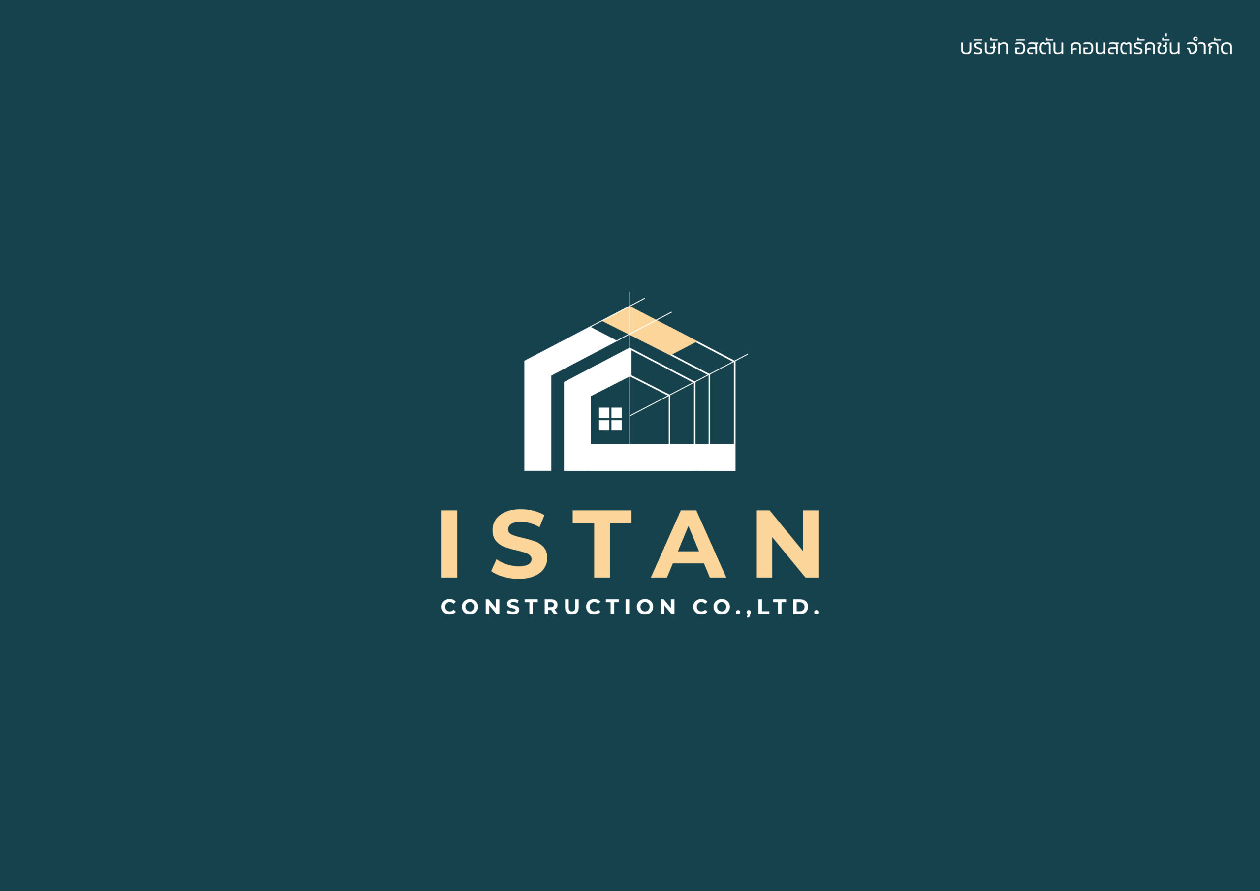
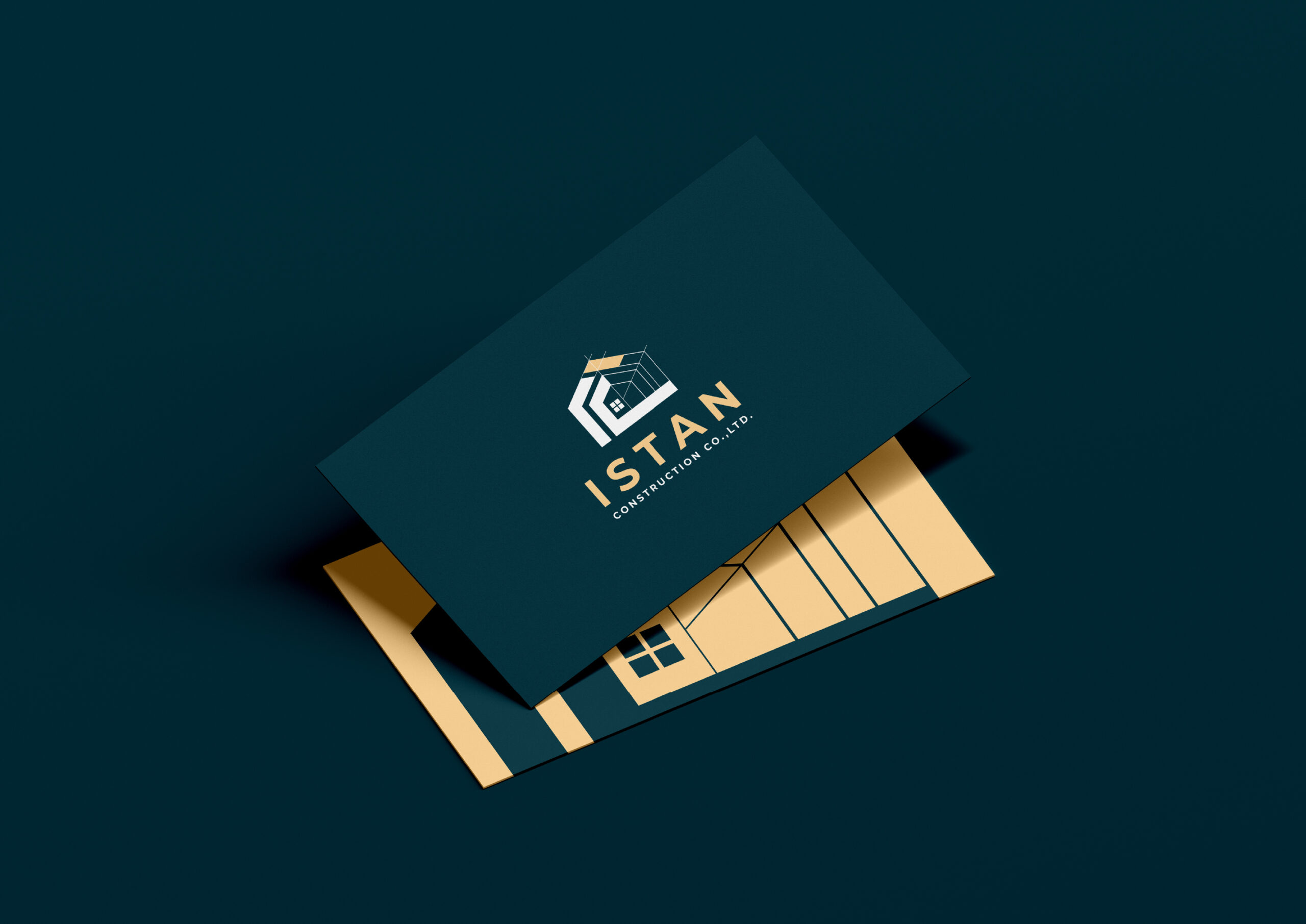
The client wanted a logo that was simple yet memorable, something that could easily stand out in a crowded industry. After sketching various concepts, I finally came up with a design that incorporated the letters “IC” in a bold and modern font. The logo also featured an abstract home shape graphic element that resembled a construction site, which aptly represented the company’s core business.
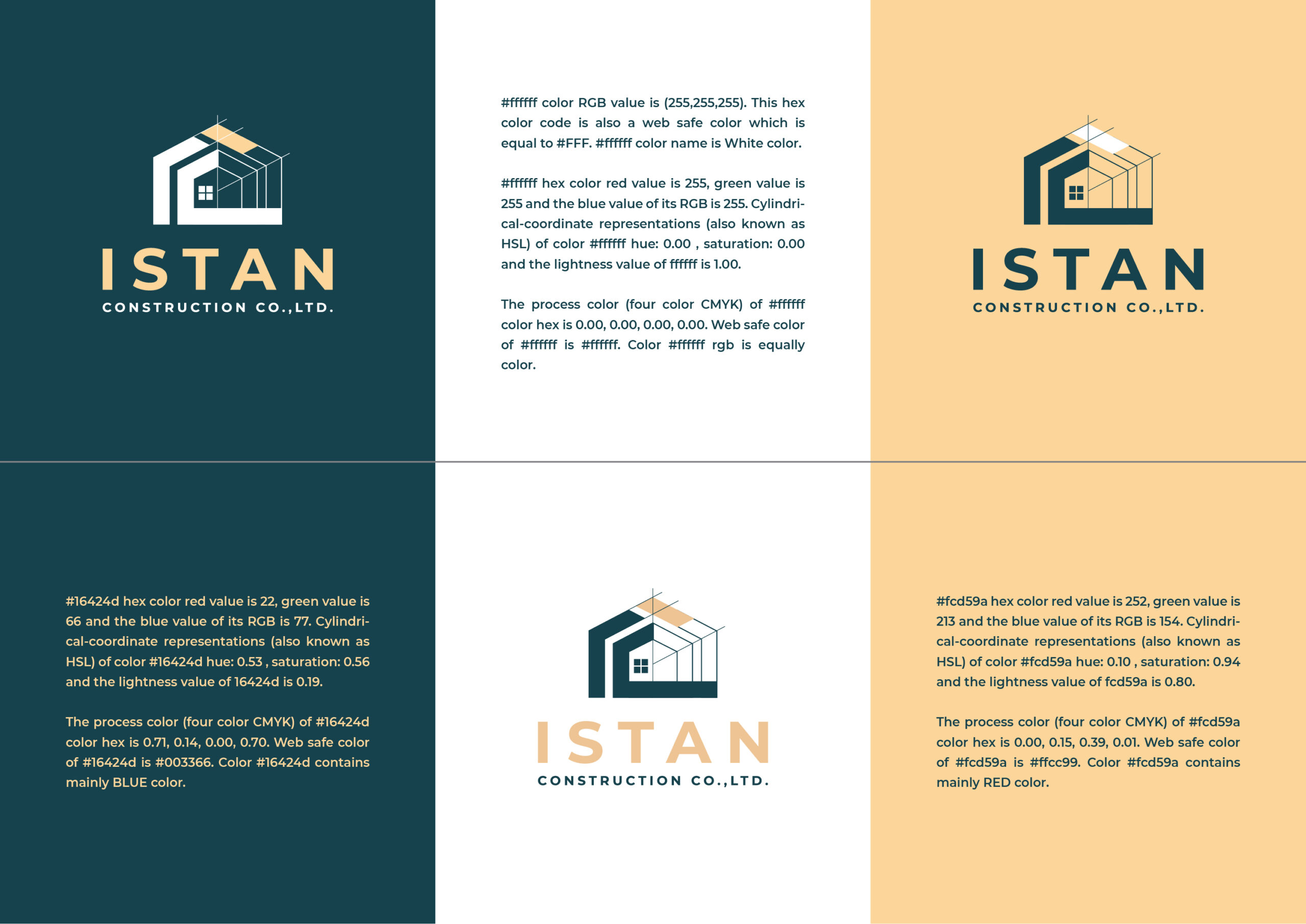
The color palette for the branding was chosen to reflect the company’s values of reliability and trustworthiness. The primary color used was green, representing professionalism and stability, while the accent color was light yellow, symbolizing energy and enthusiasm. The colors were chosen to appeal to the audience and to represent the company’s core values.

Once the logo and branding were finalized, it was time to create a set of brand guidelines to ensure consistency across all marketing materials. The guidelines included details on the use of the logo, typography, color palette, and imagery. The guidelines would help the company maintain its brand identity throughout its marketing materials, ensuring that their brand is consistently recognizable.
Overall, designing the branding for The Istan Construction was a fun and rewarding experience. Understanding the client’s vision, and the target audience was essential to create a brand identity that accurately represented the company. By researching the construction industry and the psychology behind design elements, I was able to create a unique and effective brand identity that will help the company stand out in the construction industry.